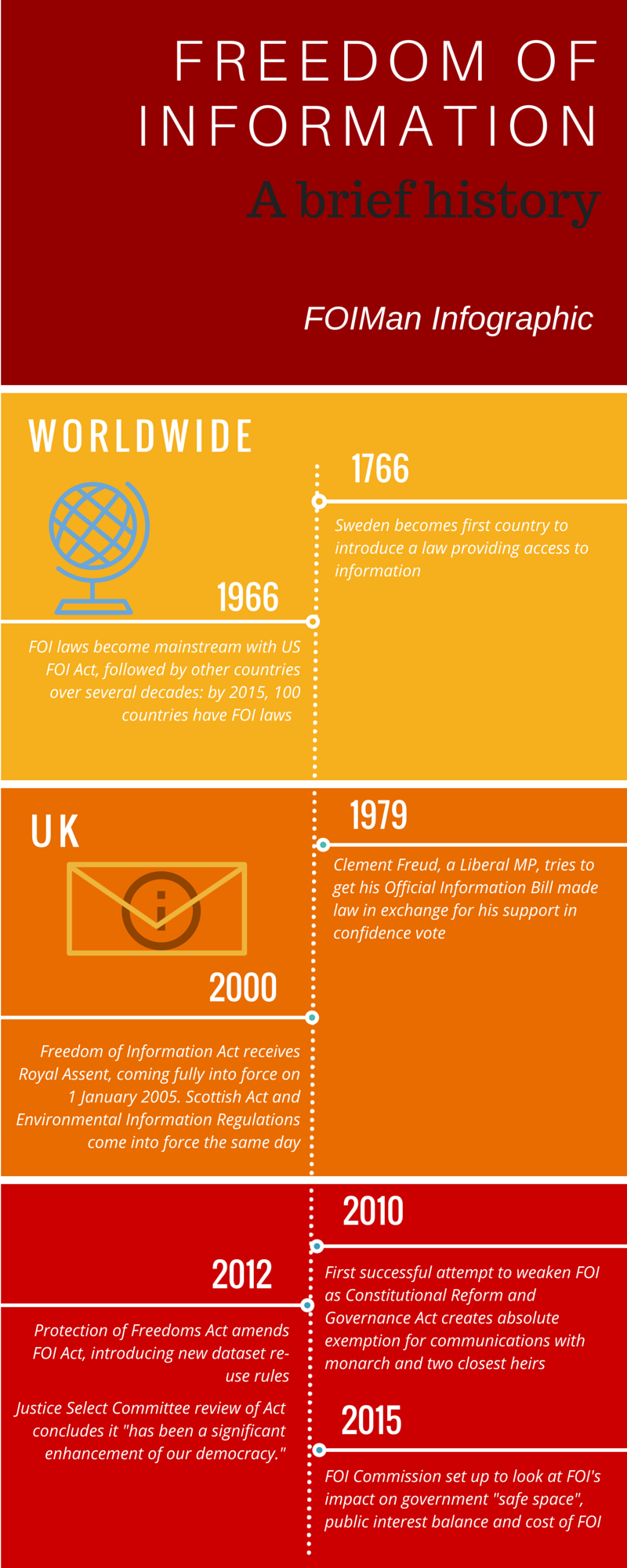
FOIMan launches a new resource – FOIMan Infographics – with a timeline summarising the history of freedom of information.
 I’m always looking for new ways to communicate about information rights. With the government once again reviewing the Freedom of Information Act and a new data protection law round the corner, the more ways there are for people to understand the implications of any changes the better.
Infographics are a brilliant way to simply illustrate facts. Anyone who is familiar with David McCandless’s Information is Beautiful will know that they have become an art form. More recently, the Human Rights Act – also under threat at present – has benefitted from the wonderful RightsInfo site and its fabulous use of graphics to get over complex ideas in a simple and effective way.
Today I’m launching a new Infographics page in the Resource section of the FOIMan site where you’ll be able to download graphics that I’ve published. I’ll also blog whenever a new graphic is available. I can’t hope that my efforts here will be as successful as the examples you’ll see at RightsInfo which are designed by professional graphic designers. But my hope is that they will help to communicate some key ideas and maybe even inspire others with better skills and resources to develop their own. You can see the first in this series on the left of this page and do go to the Infographics page where you can download the full size version in two different formats.
And please do use these graphics – re-use them for campaigning, on social media and elsewhere – that’s what they’re for. If you want to use them for commercial purposes (unlikely!) please ask – but otherwise just use them. Just make sure that you acknowledge me and if possible provide a link to this website.

